Enjoy Free Shipping Over $50
Unveiling A New Coffee Bag Design
A Brand That Embraces Change
One of my favorite things about working with Amavida Coffee is working in a culture that constantly embraces change with a team of people who are extremely creative and innovative. In the past year alone we’ve rebranded, remodeled 3 of our 4 cafes, and now we’ve redesigned our coffee packaging!
There is so much that goes into creating a coffee bag design – from the creative work, to labeling compliance, to the logistics and coordination of materials to finally putting it into production. Without a doubt the creative part is the most fun, and what I plan to focus on here.
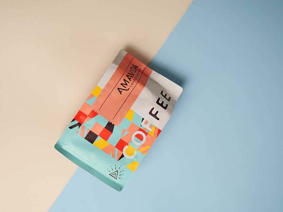
Bringing A New Coffee Bag Design Life
It truly takes a team to make all this possible, and while I’m only one person on it, I have the joy of sharing with you a bit about the new coffee bag design and what it took to bring it to life. One thing for sure, it didn’t happen overnight.
We started working on this project last fall. Designing a new coffee bag was a natural next step after our rebranding last year. We had the privilege of working with the same designer, Kevin Tudball, to bring our new branding into the design of one of the most important elements at Amavida – our coffee bag.
Why are aesthetics important in coffee packaging?
In most cases, before a person ever tries a coffee, they’ll see it in the bag. With coffee it can be challenging to communicate all of the intricacies, from the coffee’s origin to the quality of the bean to the beliefs of the brand. The packaging is our introduction to these elements. Having a quality design that is friendly, fun and eye-catching, and speaks to the uniqueness of each roast is important to give a glimpse of what one might experience when drinking the coffee inside.
How is this coffee bag design different from the previous packaging?
This new look is a huge shift from our previous bag, from the color to the type of bag. Our earlier design aimed to feature our friendly and sustainable spirit. This could be seen by the playful lowercase lettering of the logo combined with the green and brown earth tones that were our brand colors.
Many of our new branded elements still strive to show our friendly nature while also hinting at our focus on quality. We also wanted find ways to honor the beach communities we call home in our new design. To achieve that we used several colors from our new brand pallet. You’ll see the range of colors in the bag as well as the labels. In fact, there are three different label colors which help communicate a little about the coffee inside.
- Light Blue – This signifies our empowerment series. These coffees are very approachable and great for drinking all day any day.
- Coral – This color corresponds with our trekker series. These coffees have an exceptional taste, are unique in character, and are extremely memorable.
- White – This label represents our reserve series. These coffees are unforgettable with very limited availability.
[/vc_column_text][/vc_column][/vc_row][vc_row][vc_column][vc_gallery interval=”3″ images=”25406,25407,25408″ img_size=”medium”][/vc_column][/vc_row][vc_row][vc_column][vc_column_text]In the past we used green, yellow, and brown labels folded across the top of the bag to communicate similar information. Another one of our goals with this new design was to reduce the materials needed to make it allowing us to create a slightly more sustainable bag. By combining the information of the coffee and the color coding into a single label we were able to make a small stride toward this goal and reduce the total number of labels used. The new coffee bag is also shorter, so there is less material needed to make the bag itself.
That brings us to the form of the bag. Before we used a gusseted bag, which rolled down and was sealed by folding and securing it closed with a tin-tie. Today we are using a quad-seal box bottom bag with a zipper for closure. There are many unseen advantages to this, like the benefit to our production team who no longer have to spend time rolling and folding the bags. This was a conscious choice in the design, with a hope to protect our fingers from carpal tunnel in the long run. Plus, it added a benefit for our coffee drinkers, as the zipper seal offers extended freshness for the coffee inside!
What did the designer have to say about it?
At the end of the project I reflected on the experience with Kevin Tudball. We talked about his inspirations in creating the design and what kind of feelings he hopes the art invokes in people. Here is what he had to say:
“Creating this bag was a really fun process, particularly because I was able to design the branding for Amavida first. The color pallet in particular was something that I was very excited about during the branding process, and I was able to fully utilize for the new packaging. When people see Amavida’s coffee on the shelf, I want them to see a brand that is full of life and joy. I wanted to create packaging that wasn’t necessarily trendy, but fresh and genuine. I looked to more traditional design and geometric patterns for inspiration, but also tried to integrate a beach flair and sense of place. I’m really excited by the energy of the patterns in this piece, and how they’re balanced through the use of grid. And I love all the details, like the die-cut labels and the little pieces of logo integrated into the pattern. It was especially fun collaborating with the team at Amavida who cares deeply about their product, staff, and farmers. Having an excited team is the best way to develop exciting graphics.”
What does this change mean for Amavida?
Some things will always be the same. We are still the same family-owned coffee roaster in Florida, with the same aspirations to improve the lives of coffee producing communities. That said, this new bag design brings with it big change and is a step forward for us. We’re constantly striving to be better. Better for our coffee producers, our community, our employees, and the environment. For us, this new look is a way of showing the kind of business we want to be and a reflection of our values. Though it may come through in the small details, this new design is a way of sharing our passion for coffee and love for people, the planet, and our communities. We hope you love it!
Joyfully,
Jennifer Pawlik
Program Manager